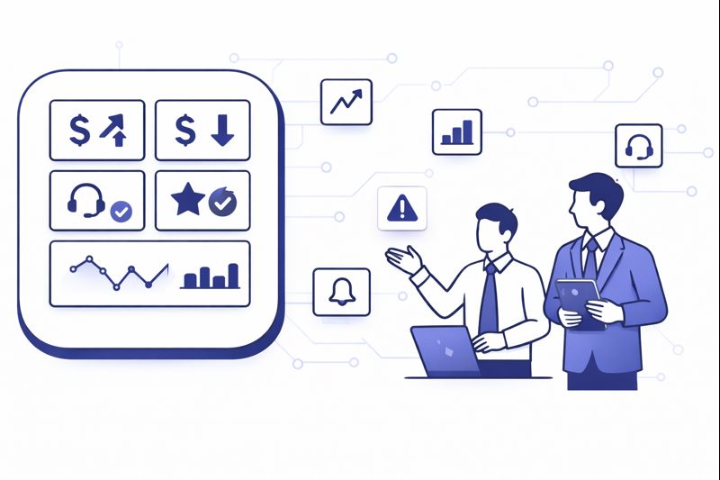
Most COOs are drowning in contact center numbers but still flying blind on the questions that matter: where profit leaks, which customers are quietly churning, and which teams are masking risk with “green” KPIs. In 2026, the advantage does not come from having more reports. It comes from a small, ruthless set of dashboards designed around decisions: which levers to pull today, which bets to fund this quarter, and which warning lights to never ignore.
1. Start From Outcomes, Not From Metrics
COOs who win with analytics start by asking “what do we want to guarantee” before they ask “what can we measure.” For most operations, the non-negotiables are: protect revenue, prevent churn, control cost per contact, and stay compliant. Only then do they decide which KPIs earn a permanent slot on the executive dashboard. That is the difference between a wallboard of noise and a reporting layer that actually prevents avoidable customer loss in the contact center.
From there, you group metrics into four outcome buckets: experience (CSAT, NPS, sentiment), efficiency (AHT, occupancy, shrinkage), reliability (abandonment, SLA, uptime) and commercial impact (revenue per contact, saves, collections). Each dashboard you build should open with this outcome view, then allow drill-downs into channels, queues and teams. If a chart does not help you change something in one of these four buckets, it does not belong on a COO-level screen.
2. The Non-Negotiable KPI Spine For Every Contact Center
Your data lake can hold hundreds of metrics. Your business cannot run on hundreds of decisions. The trick is agreeing on a small “spine” that every region, vendor and channel reports in the same way. A good starting point is a curated set of efficiency and experience metrics like those in modern efficiency benchmark guides, then layering revenue and risk on top. This creates a language that finance, operations and CX can all read without translation.
On top of the KPI spine, you design calculated fields that tell you the story behind volume spikes: contacts per order, contacts per active user, contacts per policy. These ratios reveal design flaws in product or policy that raw handle time never exposes. High performing teams also define a small set of “red line” thresholds per metric. If abandonment crosses X, or sentiment drops below Y, your dashboards stop being decorative and become triggers for playbooks.
| Dashboard | Primary Audience | Refresh Cadence | Core Questions It Answers |
|---|---|---|---|
| Executive health overview | COO, CFO, CEO | Daily and weekly | Are we protecting revenue, customer trust and cost targets this week. |
| Volume and demand mix | Ops, WFM, Product | Intraday and daily | What channels and intents are driving load now versus forecast. |
| Service level and abandonment | Ops, Vendors, COOs | Intraday | Where are we breaking SLA and why: staffing, routing or systems. |
| Efficiency and utilisation | WFM, Team Leads | Daily | Are we using agent time effectively or paying for empty seats. |
| Revenue and saves | COO, Sales, Retention | Daily and monthly | Which queues and teams drive sales, collections or churn reduction. |
| Quality and compliance | QA, Risk, CX | Weekly | Are we following scripts, disclosures and experience standards. |
| Customer journey insight | Product, CX, COO | Weekly and quarterly | What journeys cause repeat contacts, complaints and escalations. |
| Cost and capacity planning | COO, Finance, WFM | Monthly and quarterly | How headcount, AI and vendors affect multi-year cost curves. |
| Technology reliability | IT, Ops, Vendors | Daily | Is our platform stable, or are outages and latency harming CX. |
| Experiment and change tracking | COO, Product, Ops | Per change | Did this new policy, script or routing rule actually move the needle. |
3. Building Dashboards Around Decisions, Not Org Charts
Most reporting failures happen because dashboards mirror internal structure instead of customer journeys. You get separate views for “voice,” “chat,” “email,” and “WhatsApp” that never reconcile into “why customers contacted us” in the first place. A stronger pattern is to build views by intent: sales, support, risk, billing, collections. From there, channels are simply the lanes those intents travel through, like routes in a modern routing and journey orchestration engine.
At COO level, you should be able to see each intent as a mini P&L: volume, cost, revenue, and risk exposure. For example, “card declines” as one line with contacts per active user, containment rate in self-service, and downstream churn. That view usually unlocks better decisions than staring at raw AHT for “queue 17” with no context. Team-specific dashboards still matter, but they should be children of an intent-based model, not independent islands.
4. Data Plumbing: Integrations, CTI, and Source of Truth
All of this collapses if your data plumbing is weak. The core rule: every contact should have one ID that flows across telephony, digital channels, CRM and workforce systems. That requires serious attention to integrations: CTI connectors, event streams and APIs. It is why many teams treat “analytics readiness” as a key requirement when they shortlist platforms, using guidance from resources like integration catalog breakdowns rather than treating it as an afterthought.
At minimum, you need clean joins between your call records, chat logs, tickets and customer objects. CTI explanations that go beyond buzzwords, such as modern CTI deep dives, are helpful here because they show what breaks in real life: missing wrap codes, inconsistent dispositions, or agents bypassing workflows. A central data store or warehouse should own the “truth” for contact counts and durations, with CRM and BI tools reading from it in a controlled way.
5. Executive Dashboard: The COO Command Center
Your executive dashboard should load in seconds and answer five questions: are we reachable, are we resolving, are we efficient, are we compliant, and are we making or losing money through this operation. That translates into a top row of high-level KPIs and sparklines, then a small number of drill-throughs into specific queues, regions or vendors. The goal is speed to understanding, not analytic fireworks. Many COOs design this view using a subset of KPIs from ROI ranked feature and metric lists that keep attention on value, not vanity.
Underneath, you want tiles for risk and opportunity: queues that broke SLA, intents where repeat contacts spiked, and teams where revenue per contact or save rates surged. These tiles are not there to shame people. They exist so you can assign an owner and an action within the same meeting. When leadership starts treating anomalies as opportunities to learn instead of fire drills, reporting becomes a growth engine, not just a rear-view mirror.
6. Operational, WFM, and QA Dashboards That Actually Change Behavior
Team leaders and WFM need different views from the COO, but they should still map to the same spine. Intraday dashboards must show interval-level volume, handle time, adherence and backlog so schedules can be adjusted in real time. Workforce teams often pair this with forecasting views that draw directly from historical contact data and routing patterns, similar to how integration-heavy environments structure CRM and routing checklists to keep inputs clean.
QA and compliance dashboards should move away from “percent of calls sampled” toward “percent of risk covered.” AI-first quality programs, such as those described in full coverage QA case studies, allow you to score every interaction on basics like greeting and disclosure as well as empathy and resolution. Your QA dashboards then show which teams, scripts or journeys consistently underperform, rather than just which agents were unlucky enough to be sampled.
Over time, mature operations redesign QA views around both AI scores and human calibration. That is where resources like AI quality monitoring frameworks and modern QA scorecard templates become practical, because they emphasise patterns and coaching opportunities rather than individual “gotcha” calls.
7. AI and Advanced Analytics: From Descriptive to Predictive
Once your basics are stable, AI should help you answer a different class of questions: which queues will break SLA tomorrow, which cohorts are about to churn, which macro changes will matter more than incremental coaching. The path there is incremental. Start with anomaly detection on your key KPIs, then progress to forecasting and “what if” models that simulate the impact of staffing or policy changes on SLA, backlog and cost. This is similar to how teams apply AI to labour and process decisions in cost cutting playbooks for contact centers.
Voice and text analytics then give you a second layer: what customers are actually saying and how that connects to outcomes. If you operate across Arabic and English markets you also need models that understand local languages and dialects, using approaches similar to Arabic-focused call analytics guides. Those insights feed your product roadmap, training plans and even fraud models, since spikes in certain phrases or intents often precede measurable KPI shifts.
Finally, AI-driven coaching completes the loop. Real-time assist and guidance, like the stacks described in live agent coaching solutions, depend on strong analytics foundations. If you cannot measure what “good” looks like, you cannot ask AI to nudge agents toward it in real time.
8. Compliance, Risk, and Auditability Inside Your Dashboards
For regulated industries, reporting must satisfy auditors and regulators as well as executives. That means dashboards with clear evidence of consent flows, disclosure rates and recording behaviour, not just internal targets. Modern teams use unified compliance views inspired by call recording compliance frameworks, where you can filter by product, region or vendor and see exactly where legal and policy risk is concentrated.
On top of this, you need transparent histories for configuration changes: who changed routing, scorecards or thresholds, and when. Incidents are inevitable. What matters is your ability to reconstruct what data was visible at the time, which decisions were taken based on that data, and whether controls worked as intended. If your dashboards cannot support that narrative during an audit or board review, your reporting architecture is not finished.
9. Cost, TCO, and Investment Dashboards For Multi-Year Decisions
Every structural change in the contact center eventually lands on the COO’s desk as a cost question. Should we outsource another region, invest in AI, or open a new site. You need dashboards that show cost per contact by channel, intent and vendor over time, alongside the impact of automation and technology changes. Practical tools like contact center cost calculators and pricing breakdown guides are useful inputs, but the real power comes from marrying them with your own historical data.
For larger bets, treat dashboards as “living business cases.” When you migrate from on-prem ACD to cloud, or roll out a new AI stack, create a specific view that tracks the promised savings and experience improvements against real outcomes. That view should be visible to finance and technology leaders as well as operations. If the numbers do not move, you either adjust the implementation or accept that the investment is not paying off, rather than letting it hide inside base budgets.
10. 90-Day Roadmap To Reporting That Deserves Executive Attention
Days 1–30. Audit your current reporting: list dashboards in use, metrics tracked, and who uses what. Identify duplicated KPIs with different definitions, manual spreadsheet work, and any view nobody can explain in under two minutes. In parallel, verify that your data plumbing can support a single contact ID and a unified spine of metrics, building on integration patterns from integration-first buyer guides.
Days 31–60. Design and build the executive and key operational dashboards first. Lock definitions for the KPI spine, then update systems so they write consistent dispositions, wrap codes and outcomes. Connect QA and compliance data if possible, using tooling patterns from AI-assisted QA programs. Run these dashboards in parallel with your old reports so you can reconcile differences and build trust.
Days 61–90. Turn off obsolete dashboards and make the new ones the default in leadership and operations reviews. Train managers to use them, not just read them. Introduce the first wave of AI assistance: anomaly flags on the executive dashboard, and automated alerting for breaches of your red line thresholds. From this point on, any new change in routing, policy or technology should come with a named panel or tile on an existing dashboard, not a new standalone report.